Heatmaps and Change over Time
With data like that from SlaveVoyages.org, our maps can quickly become cluttered with overlapping symbols. The great span of time the data covers and the fact that the same ports hosted many voyages make visual representation a challenge. For that reason, we want to look beyond simple point symbols or even graduated point symbols to visualize the data. In this tutorial we’ll examine two complimentary ways of dealing with this challenge: heatmaps and a time animation.
Contents
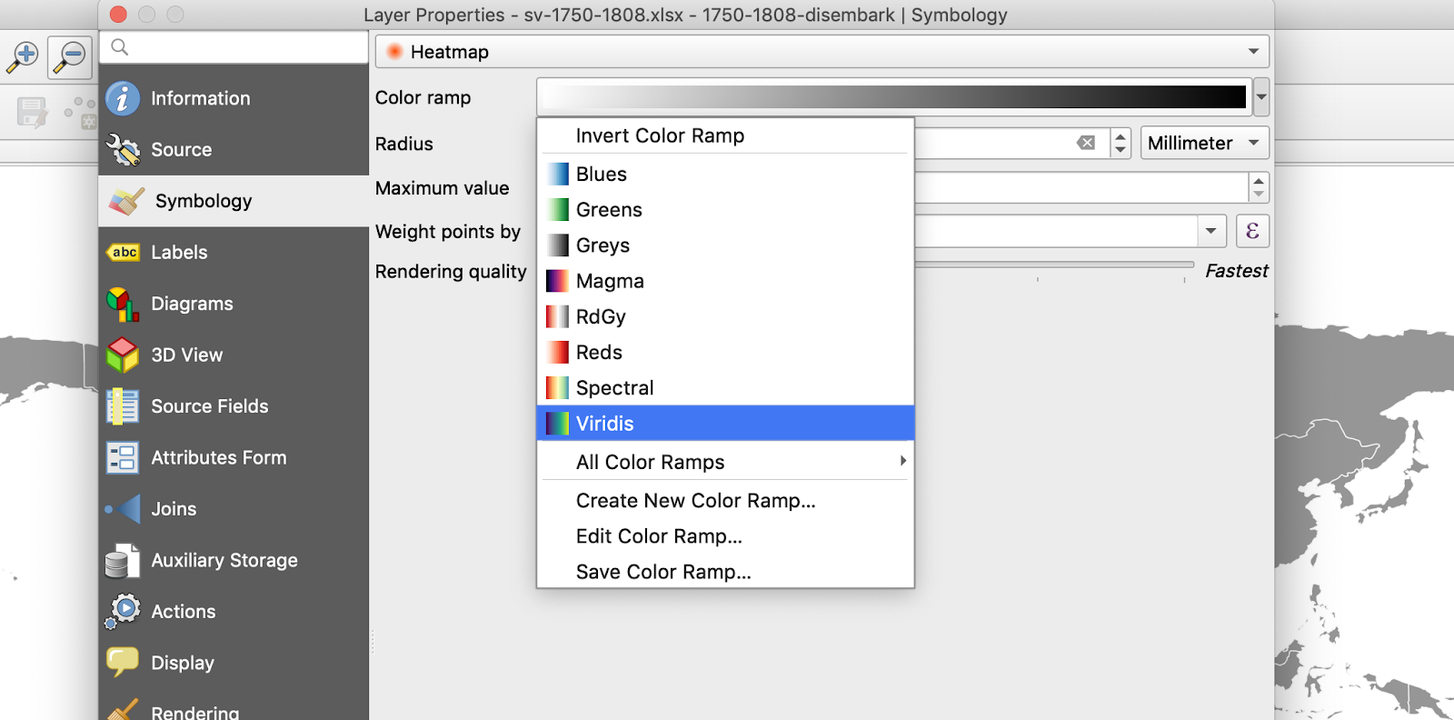
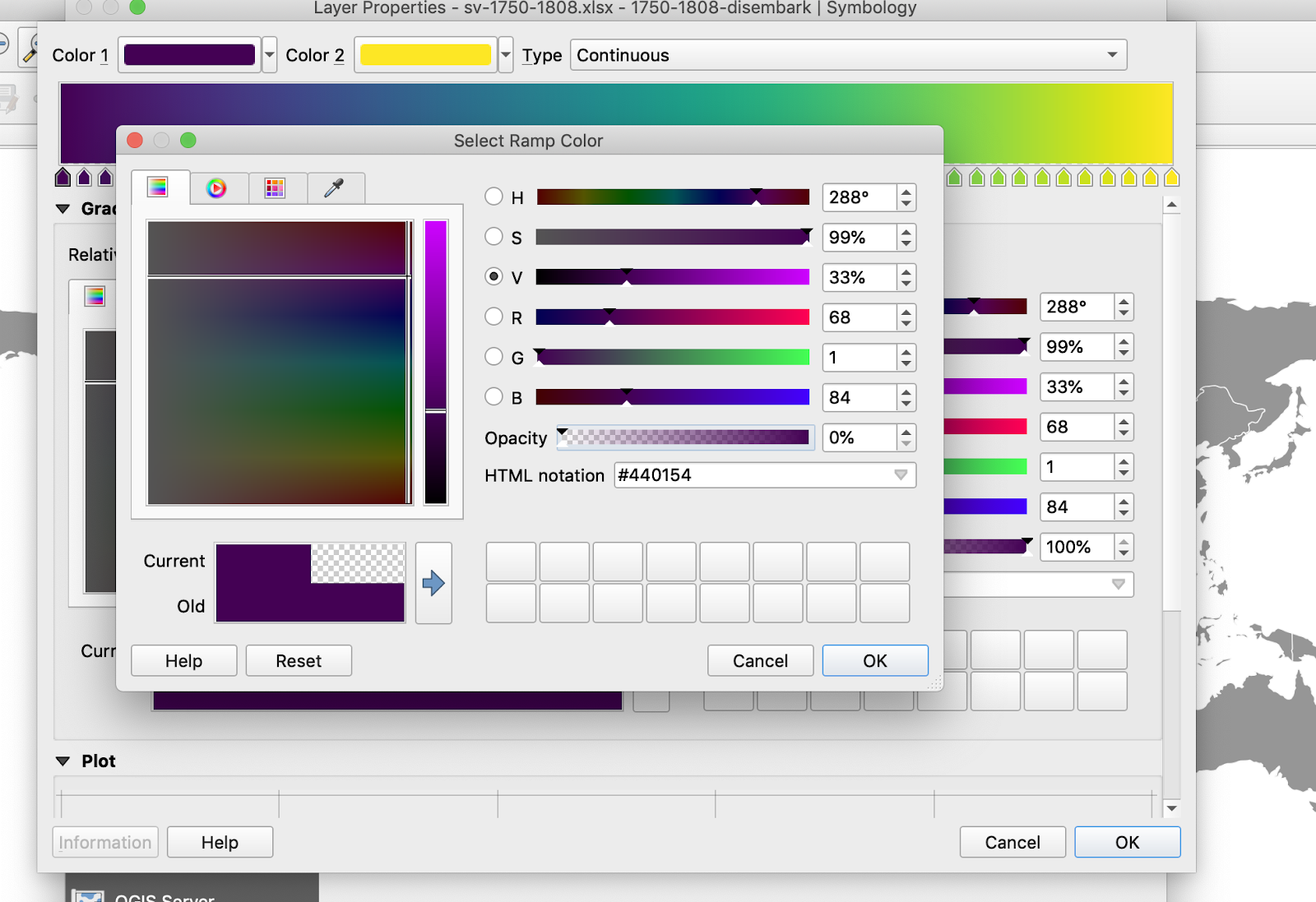
A heatmap uses a color ramp to illustrate the relative number of points in a given area. If the color ramp goes from light to dark, this means that the lighter the visualization becomes the more points are concentrated in that area and the darker the fewer points. We are most used to seeing heatmaps in our weather reporting apps with the color range referring to things like rainfall, storm intensity, or perhaps literally heat. In QGIS, the Symbology controls make generating a heatmap very simple.
For this tutorial, we will use the data you worked with from the previous map. Open QGIS, create a new project, and name it “sv-1750-1808-heatmap.” Add the same basemap we used before, then add the CSV file “sv-1750-1808-disembark.” We’ll use this to generate a heatmap that illustrates the numbers of enslaved individuals that arrived in the Americas through this period. Once you’ve added in your CSV layer and see it on the map, do the following:
You should see a heatmap of your data now in place of individual points.
As we’ve already noted, the colors correspond to lower or higher numbers of points, each of which corresponds to a row on our spreadsheet. In this case, since each row corresponds to a particular voyage, higher values mean a greater number of ships stopped at a given port within the given time frame.
Now the colors reflect both the number of stops and the overall number of enslaved individuals represented in those stops. You should see a difference, though it may be subtle.
Take a screenshot of your map, or export it as an image file to upload to Canvas.
Another approach to visualizing change over time is a timeline. In terms of GIS, a timeline function filters your data according to a specified segment of time, for instance year by year. You can then drag a slider or simply hit play and see an animation of how your data changes from year to year. You can usually decide to see snapshots of the data as the timer progresses or see that data accumulate on your map.
To do this in QGIS, we'll use the Temporal Controller feature. First we'll need to make some adjustments to the data layer.

Double click your data layer, scroll toward the bottom of the left hand menu, and click “Temporal.”
Check the box at the top left labeled “Temporal.” This tells QGIS that this layer as time-related information.
For Configuration select “Single Field with Date/Time.”
For Field select “Date.”
Now we can turn on the Temporal Controller feature.

In the top icons menu, find the clock icon and click it. This should open a control menu that will be mostly black initially.
Click the small play button at the top left of this menu. When you hover over it, it will say “Animated temporal navigation.” This will turn on the time animation controls.
For Range, set the start date to “1748-01-01” and the end to “1808-01-01.”
For Step, set it to move ahead 1 year at a time.

Now you can use the controls to play the time animation. You should see the heatmap data emerge and accumulate as the slider moves along. As you examine the animation, consider what changes you see over time. How might we explain them?
Save your map, and be sure to take a screenshot to upload to Canvas.
One final note about filtering when downloading data from SlaveVoyages.org. When you navigate to the database section of the site, you'll find a list of categories near the top of the page starting with "Year range," "Ship, nation, owner," and so on. You can set filters on each of these if you wish. We've gone over setting a year range filter in the previous tutorial.
If you want to add an additional filter that targets, for example, the principle place of purchase, you can do that by selecting "Itinerary" and then the "Place of purchase" tab. Then in the field "Principal place of slave purchase" input your search terms (e.g. "West Central Africa"). If there are results, you can check the box next to the categories you wish to include. When you've done that, click Apply at the bottom of the window. The results visible in the database should reflect what you've selected. You can verify what filters you currently have set in the light gray strip above the database results.
When you have what you want, you can download the filtered dataset by clicking Download > CSV [or Excel] > Filtered results with visible columns.


The land on which we gather is the unceded territory of the Awaswas-speaking Uypi Tribe. The Amah Mutsun Tribal Band, comprised of the descendants of indigenous people taken to missions Santa Cruz and San Juan Bautista during Spanish colonization of the Central Coast, is today working hard to restore traditional stewardship practices on these lands and heal from historical trauma.
The land acknowledgement used at UC Santa Cruz was developed in partnership with the Amah Mutsun Tribal Band Chairman and the Amah Mutsun Relearning Program at the UCSC Arboretum.


 Santa Cruz, CA